Frame
Overview
Frame is required to adjust the borders of your gauge and, may be, its background. You can choose the shape of your frame and determine whether it has borders. Frames can have two borders: inner and outer. You can also add effects to your frame.
Frame settings
The following attributes are available for frame node:
| Attribute |
Values |
Default |
Description |
| enabled |
True | False |
True |
Determines whether frame is enabled or not. |
| padding |
Number |
0 |
Sets the frame padding in percents. |
| type |
Auto | Circular | Rectangular | AutoRectangular |
Auto |
Sets the frame padding in percents. |
| auto_fit |
True | False |
True |
Determines whether frame is automatically fitted to the size of the container. |
| crop_content |
True | False |
False |
Determines whether the content is cropped if it doesn't match container's sizes. |
enabled attribute determines whether the whole frame is enabled or not, including inner and outer borders. padding is responsible for the padding of all 4 frame borders. type node describes the type of frame shape. By default it is set to Auto and naturally depends on the gauge's sweep_angle attribute of axis node. auto_fit and crop_content describe how the content is positioned inside the frame and whether it is cropped or not if doesn't match sizes.

Inner/Outer stroke
Both inner_stroke and outer_stroke have 2 attributes: enabled and thickness, their destination is evident. Also each of these nodes has 4 subnodes, responsible for strokes' visual appearance: fill, hatch_fill, border and effects.
Lets create a simple frame with no strokes. All we need to do is set enabled attribute to "true". Then we disable both strokes. XML looks like this:
01 |
<frame enabled="true"> |
02 |
<inner_stroke enabled="false" /> |
03 |
<outer_stroke enabled="false" /> |
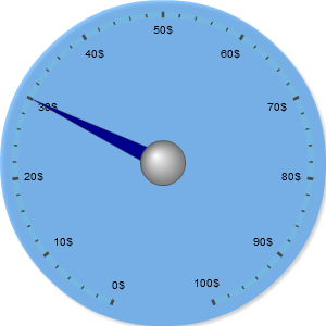
That's great, we have our frame, but we can't see it. So let's set appropriate background settings for it:
01 |
<frame enabled="true"> |
02 |
<inner_stroke enabled="false" /> |
03 |
<outer_stroke enabled="false" /> |
04 |
<background enabled="true"> |
05 |
<fill enabled="true" type="solid" opacity="0.5" color="#1E90FF" /> |
So the result is below:
Live Sample: Circular frame sample 1
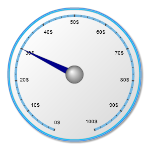
Now let's get some use of strokes. Let's imagine we don't need to color all the area of our gauge but only borders. Then we use the following XML settings:
01 |
<frame enabled="true"> |
02 |
<inner_stroke enabled="true" thickness="2"> |
03 |
<fill enabled="true" type="solid" color="#00BFFF" /> |
05 |
<outer_stroke enabled="true" thickness="2"> |
06 |
<fill enabled="true" type="solid" color="#1E90FF" /> |
And as a result we have 2 thin borders:
Live Sample: Circular frame sample 2
Frame type
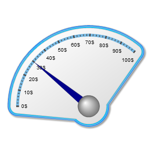
So, as it was said above, frame can have 4 types: auto, circular, rectangular and auto_rectangular. By default frame type is set to auto and depends on sweep_angle. What does it mean? Let's have a look. We take the previous example and add the following settings for the axis:
01 |
<axis start_angle="90" sweep_angle="130" /> |
Live Sample: Circular frame sample 3
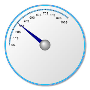
Well as you see the unused space is cropped now. And that's what we get is type is circular:
01 |
<frame enabled="true" type="circular" /> |
Live Sample: Circular frame sample 4
The same is for auto_rectangular and rectangular, but in this case the content is cropped or not cropped on the base of a rectangular shape.
Visual appearance
The are several ways of adjusting frame's visual appearance. These are background and effects, their settings are similar to chart settings. One more way is to use corners node. Its attributes are as follows:
| Attribute |
Values |
Default |
Description |
| type |
Square | Cut | Rounded | RoundedInner |
Square |
Sets the shape of corners. |
| all |
Number |
0 |
Sets the size of all corners in percents, effective for all types except "Square". |
| left_top |
Number |
0 |
Sets the size of left top corner in percents, effective for all types except "Square". |
| right_top |
Number |
0 |
Sets the size of right top corner in percents, effective for all types except "Square". |
| right_bottom |
Number |
0 |
Sets the size of right bottom corner in percents, effective for all types except "Square". |
| left_bottom |
Number |
0 |
Sets the size of left bottom corner in percents, effective for all types except "Square". |
Now let's use corners subnode. We take a gauge with stroke from the previous example and want to improve the visual appearance of our strokes by making the corners round. So at first we set type of frame to auto_rectangular or rectangular, because only it makes sense to smooth corners only for rectangular-shaped frames. Let the shape of our frame be auto-rectangular:
01 |
<frame enabled="true" type="AutoRectangular" /> |
Then we set the following settings for the axis
01 |
<axis sweep_angle="70" /> |
Then create corners node, set type to "Rounded", all to "5" and right_bottom to "40" - the bottom right corner will be much more rounded. XML looks like this:
01 |
<frame enabled="true" type="AutoRectangular"> |
02 |
<inner_stroke enabled="true" thickness="2"> |
03 |
<fill enabled="true" type="solid" color="#00BFFF" /> |
05 |
<outer_stroke enabled="true" thickness="2"> |
06 |
<fill enabled="true" type="solid" color="#1E90FF" /> |
08 |
<corners type="Rounded" all="5" right_bottom="40" /> |
And that's what we get:
Live Sample: Circular frame sample 5