Pyramid Chart
Overview
Pyramid charts are column (or bar chart) that use Pyramid shaped items to show data. Although pyramid charts do not add any additional data, sometimes using this shape allows to achieve a better visual appearance of your data.
![]()
Chart Building
As Pyramid charts are just a usual bar charts of a pyramidal shape, to create such type of chart you should set shape_type="Pyramid" attribute in <bar_series>, <series> or <point> nodes.
If you will set this attribute in <bar_series> all bar or column series will be displayed as Pyramid, if you will define it in <series> or <point> - only certain series or point will become pyramidal.

01 |
<data> |
02 |
<series type="Bar" shape_type="Pyramid"> |
03 |
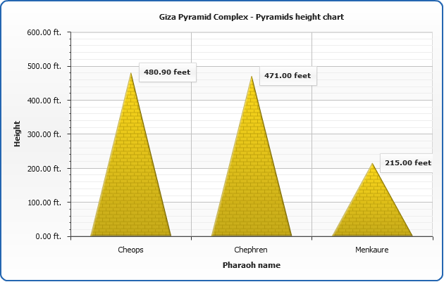
<point name="Cheops" y="480.9" /> |
04 |
<point name="Chephren" y="471" /> |
05 |
<point name="Menkaure" y="215" /> |
06 |
</series> |
07 |
</data> |
An example below depicts Giza Pyramid Complex - Pyramids height comparison chart:
![]()
Stacked Pyramid Charts
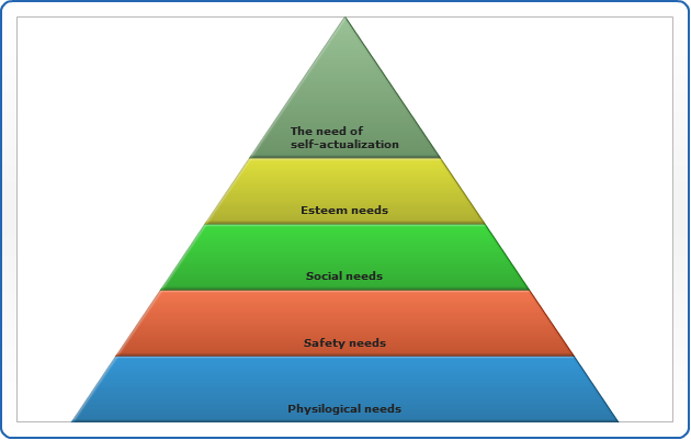
As well as other bar charts Pyramid charts can be stacked, below we will plot a Maslow's Hierarchy of Needs pyramid, move the mouse to see a detailed needs description, custom data attributes are used to store additional data to be shown in tooltips:
01 |
<y_axis enabled="false"> |
02 |
<scale mode="PercentStacked" /> |
03 |
</y_axis> |
![]()
3D Pyramid Charts
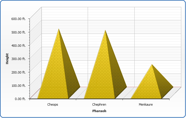
And to make pyramid look like pyramids - you can enable 3D mode:
01 |
<data_plot_settings enable_3d_mode="true" /> |
![]()