Percent Stacked Bar/Column Chart
Overview
Data that is arranged in columns or rows on a worksheet can be plotted in a bar chart. Bar charts illustrate comparisons among individual items.
100% stacked bar charts compares the percentage each value contributes to a total across categories. A 100% stacked bar/column in 3-D chart displays the rectangles in 3-D format; it does not display the data in 3-D format.

Chart Building
As percent stacked charts should show percent contribution of different components to the total,
we will demonstrate them on an imaginable ACME FastFood, Corp. sales. Let's assume
that it sells Ice Cream, Chocolate Bar and Coke all through the year.
So, we have three series of data - one series for each product, and we give proper names to each series:
02 |
<series name="Ice Cream"> |
03 |
<point name="Winter" y="12000" /> |
04 |
<point name="Spring" y="13000" /> |
05 |
<point name="Summer" y="25000" /> |
06 |
<point name="Autumn" y="16000" /> |
08 |
<series name="Chocolate Bars"> |
09 |
<point name="Winter" y="12000" /> |
10 |
<point name="Spring" y="12000" /> |
11 |
<point name="Summer" y="15000" /> |
12 |
<point name="Autumn" y="16000" /> |
15 |
<point name="Winter" y="10000" /> |
16 |
<point name="Spring" y="17000" /> |
17 |
<point name="Summer" y="19000" /> |
18 |
<point name="Autumn" y="16000" /> |
Now we have to tell Y Axis to display these series in as percent stacked columns:
03 |
<scale mode="PercentStacked" /> |
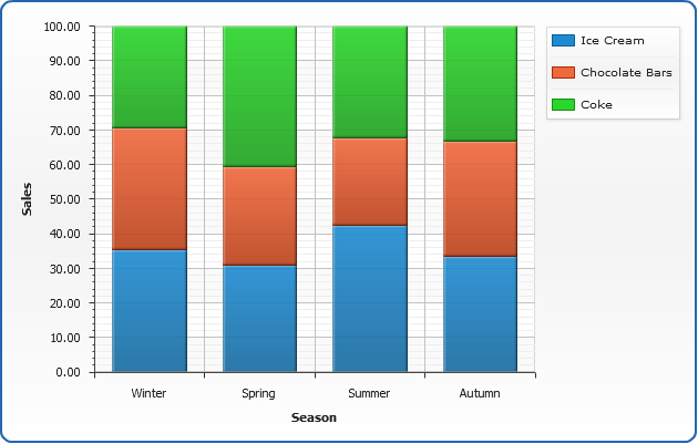
Everything is ready, here is a sample percent stacked column chart:
Live Sample: Sample Percent Stacked Column Chart
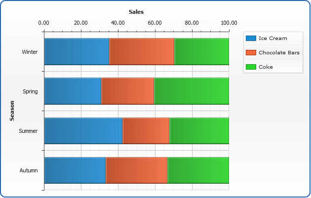
Percent Stacked Bar Chart
Just change "plot_type" to "CategorizedHorizontal" and get your data
displayed as a bar chart:
01 |
<chart plot_type="CategorizedHorizontal" /> |
Also, let's add tooltips and make them more informative, to that we will change their format:
02 |
<tooltip_settings enabled="true"> |
03 |
<format><![CDATA[{%SeriesName} - {%Value}$ - {%YPercentOfCategory}{numDecimals:2}%]]></format> |
Here is a sample percent stacked bar chart:
Live Sample: Sample Percent Stacked Bar Chart
Adding "%" to axis labels
If you want to add percent symbol to axis labels - format
the axis labels in the following way:
03 |
<labels align="inside"> |
04 |
<format><![CDATA[{%Value}%]]></format> |
06 |
<scale mode="PercentStacked" minimum="0" maximum="100" /> |
Here is a sample stacked column chart with "%" labels, and notice align="inside"
in <labels> node - this is an attribute that aligns labels.
Live Sample: Sample Percent Stacked Column Chart Percent Labels
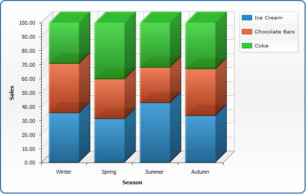
3D Percent Stacked Column Chart
One more quick feature demo - enabling 3D mode makes column chart three-dimensional:
01 |
<data_plot_settings enable_3d_mode="True" /> |
The sample of 3D Column chart at a glance:
Live Sample: Sample 3D Percent Stacked Column Chart